Client

taste of thai

Industry

food & drink, Hospitality

establishment

brick & mortar restaurant

product/service

thai cuisine

work type
freelance
medium

print - synthetic paper

services provided
print design
visual identity
graphic design
photography
Overview

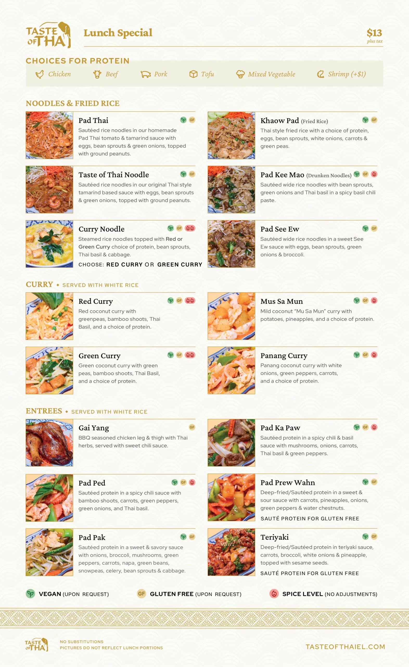
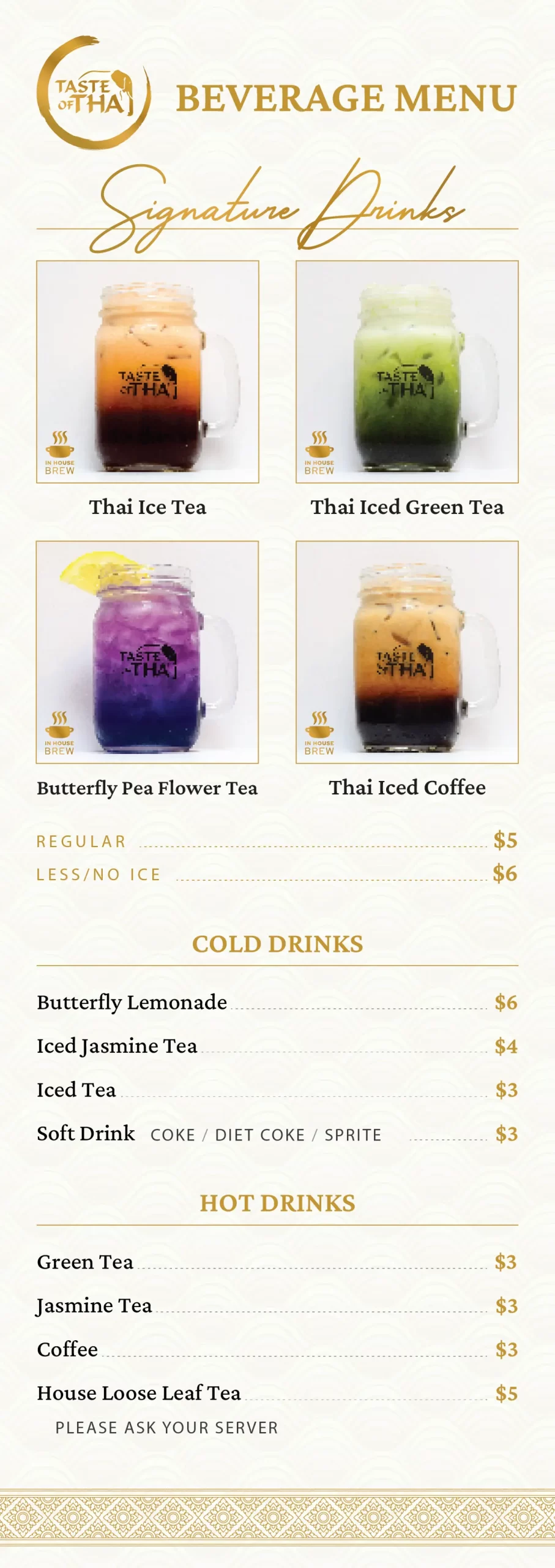
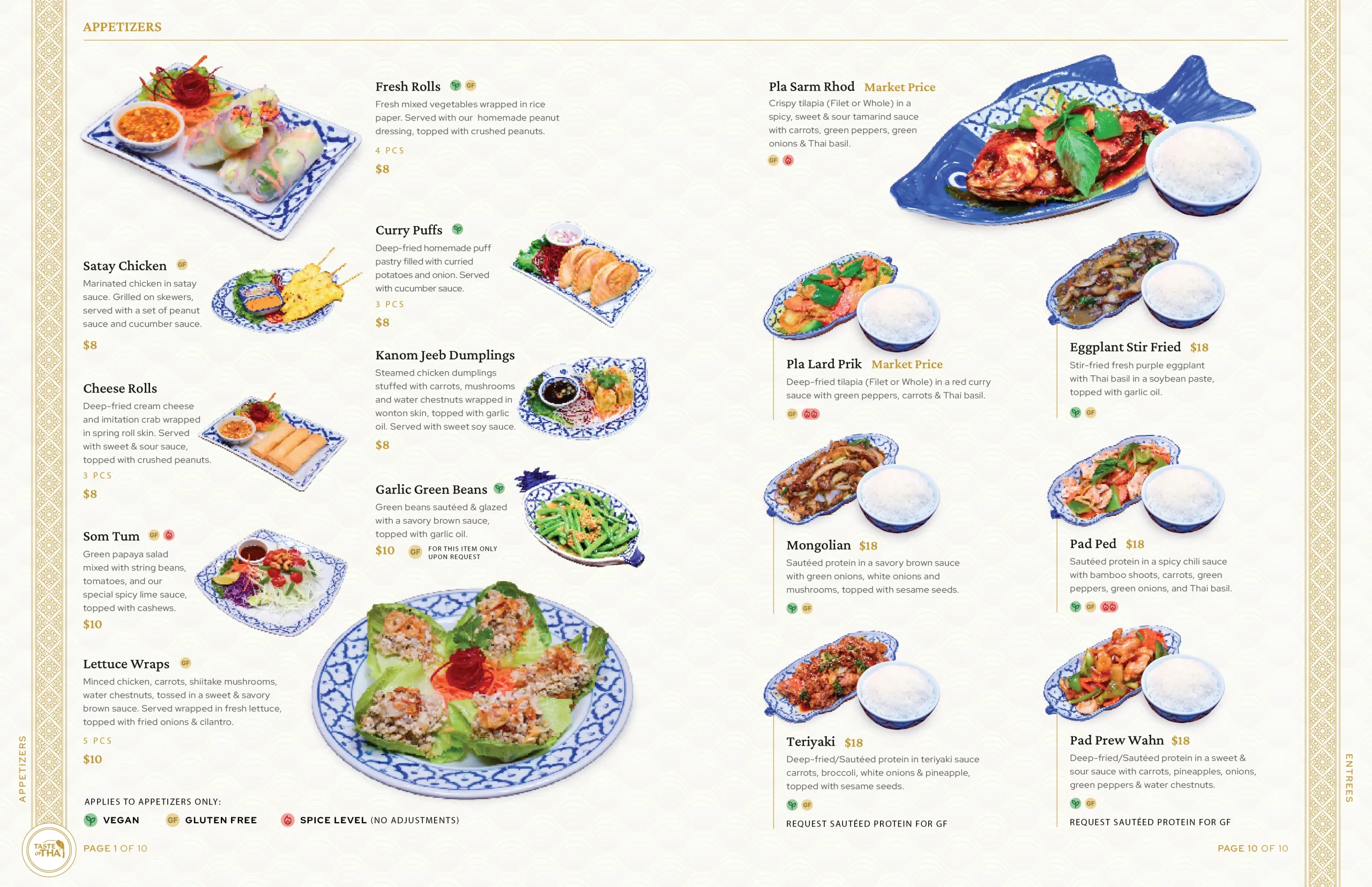
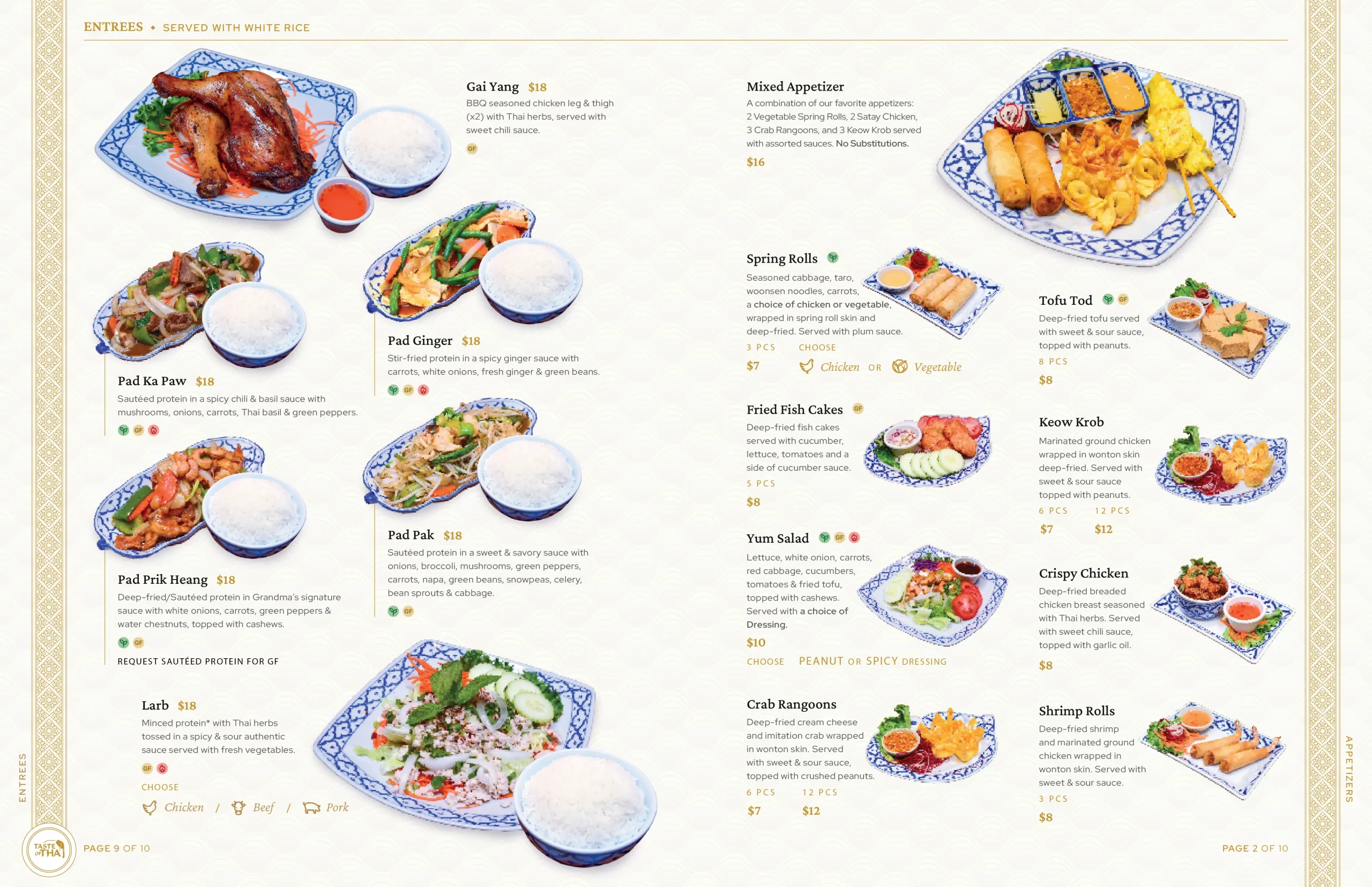
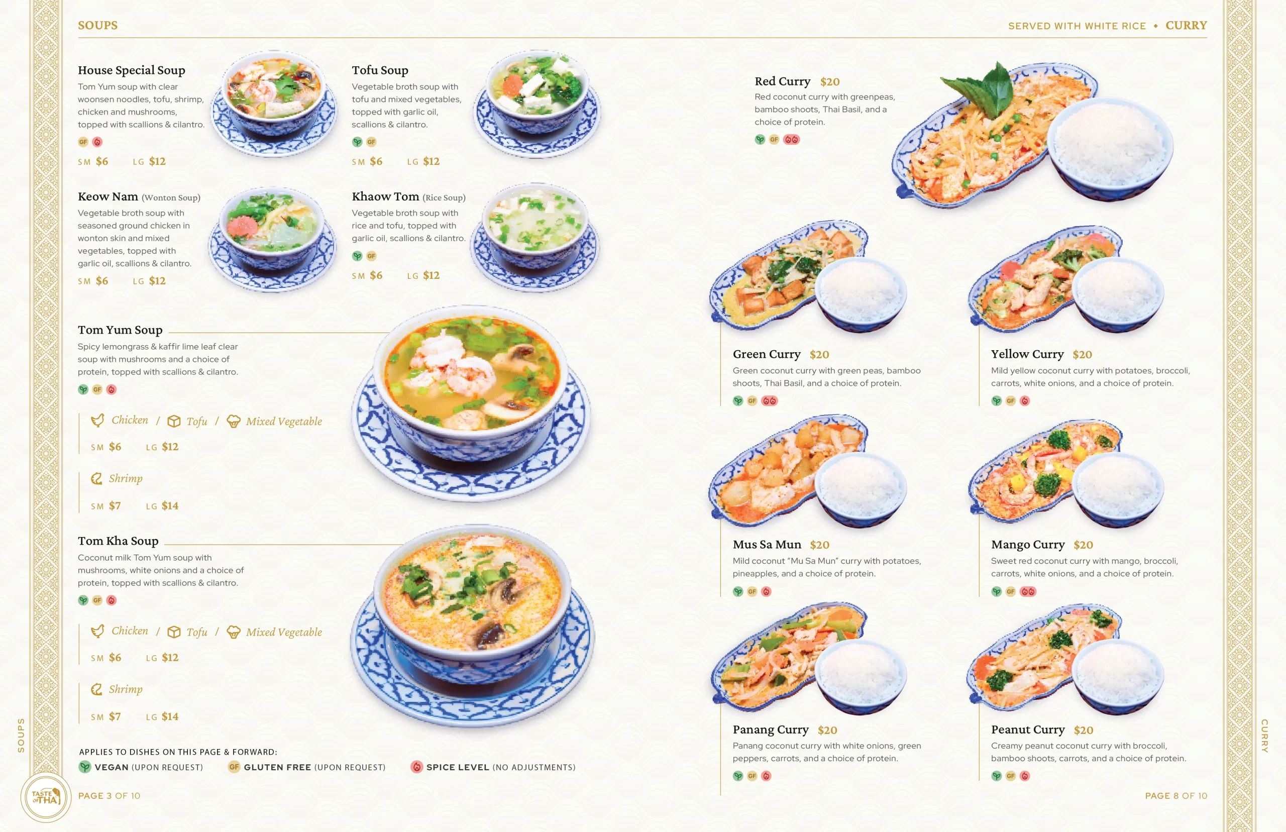
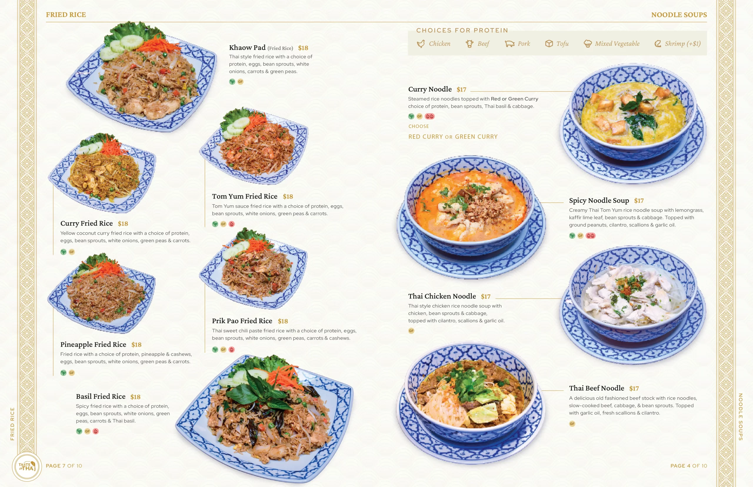
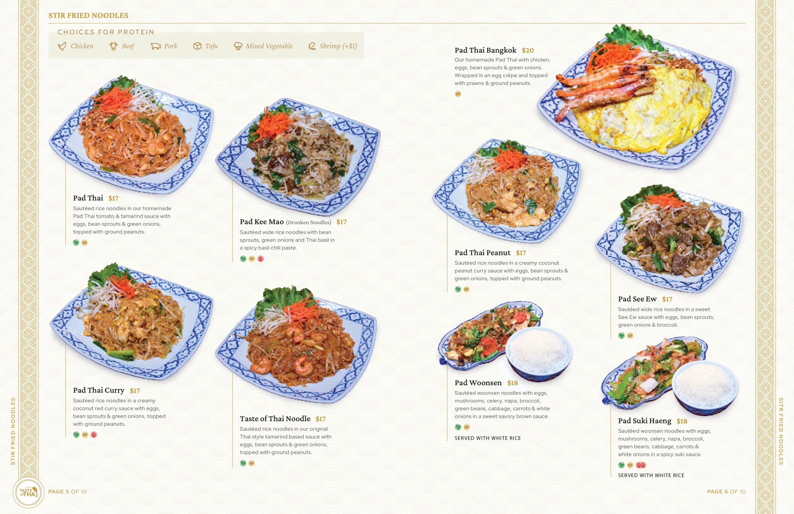
High-quality food imagery with a refined, modern layout, the new menus not only catch the eye but also provide a seamless experience for both the customer and the restaurant.

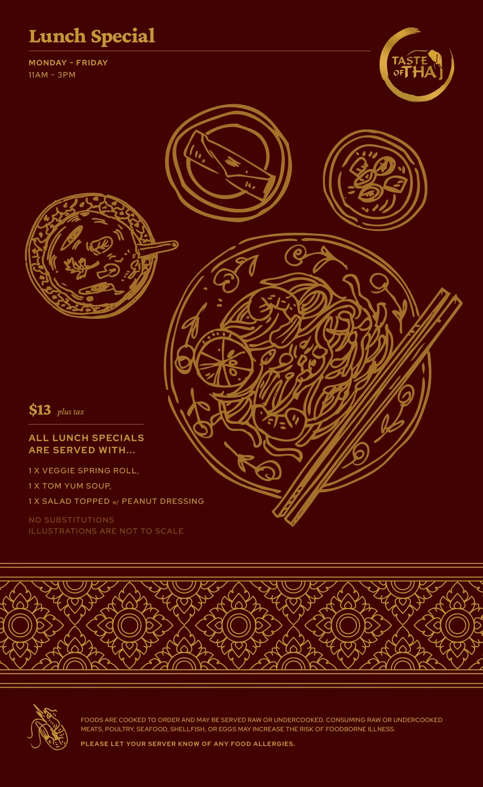
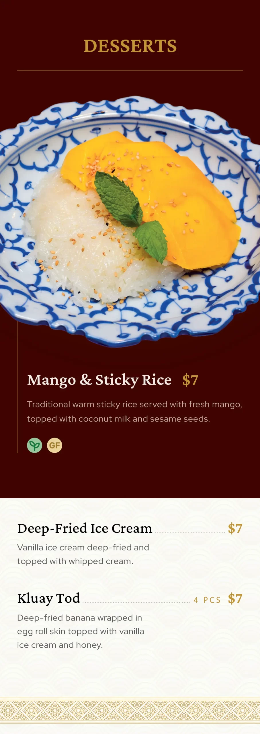
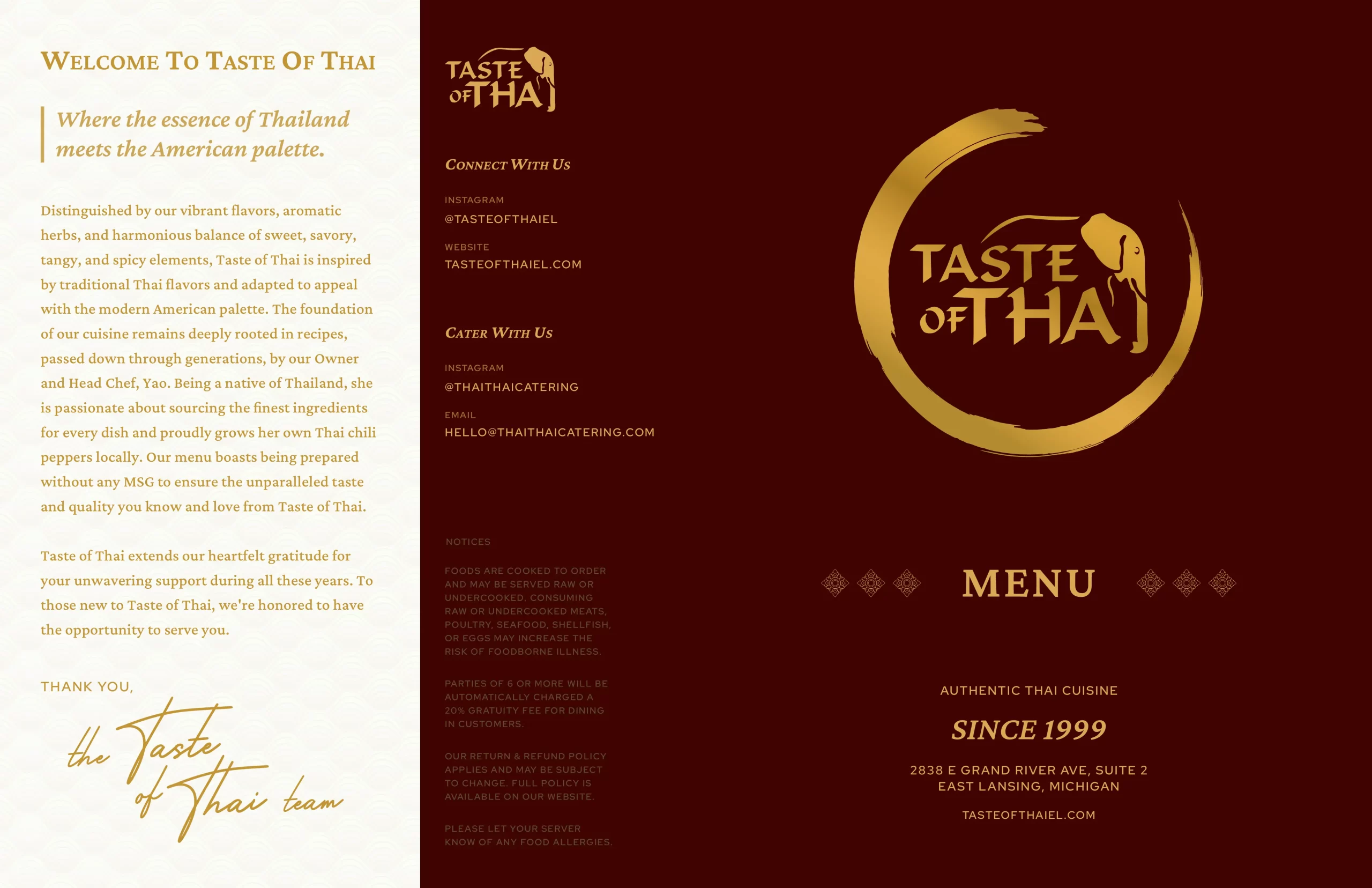
For the second iteration of Taste of Thai’s menu design, I focused on creating a refined, modern layout that elevates both the visual appeal and the overall customer experience. Central to the redesign is the integration of high-quality food photography, which highlights the vibrant colors and textures of each dish, reflecting the restaurant’s dedication to quality. I also utilized traditional Thai patterns and design elements, seamlessly weaving them into the modern layout to maintain an authentic cultural feel while giving the menu a fresh, contemporary edge.

considerations

The modern layout was designed with careful attention to key design principles such as visual hierarchy, clarity, and balance. I used a clear, intuitive structure that guides the eye naturally through the menu, ensuring customers can easily navigate between sections. Strong typography choices and strategic use of white space allow for readability and prevent the layout from feeling cluttered. Icons were thoughtfully incorporated to visually represent key attributes, like gluten free or spice in dishes. The color palette was selected to complement the vibrant food imagery while maintaining a clean, cohesive aesthetic that aligns with the restaurant’s brand. By using these design practices, I created a menu that is not only visually engaging but also user-friendly, ensuring a seamless and enjoyable experience for the customer.
 
When selecting the print medium, I prioritized both longevity and visual appeal in a high-traffic environment, considering the needs of both the customer and the restaurant. To achieve this, I chose synthetic paper—an innovative material known for its exceptional durability and long-lasting finish. Unlike traditional paper, synthetic paper resists tearing, staining, and fading, making it an ideal choice for menus that are frequently handled. This not only ensures a premium look and feel for the customer but also saves the restaurant money in the long run, as the menus will require less frequent replacement. Additionally, the material is easy to clean, allowing for quick wipe-downs after each use, further reducing maintenance time and costs. By combining functionality with a refined aesthetic, I ensured the menus meet the restaurant’s needs for both durability and style, continuing to serve the brand while remaining cost-effective and low-maintenance.

final notes

A restaurant’s menu is far more than just a list of options—it’s a central part of the dining experience. Recognizing this, every detail was thoughtfully considered to ensure the menu not only serves its functional purpose but also enhances the overall atmosphere. From the modern layout to the careful selection of typography and imagery, each element was designed to reflect the restaurant’s essence and provide a seamless, engaging experience for guests. The menu becomes an extension of the restaurant’s identity, guiding guests through their culinary journey while reinforcing the brand’s story. This cohesive design approach ensures that the menu plays a key role in shaping the customer’s experience, creating a lasting impression from the moment it’s placed in their hands.

project

menu design 2

client

taste of thai